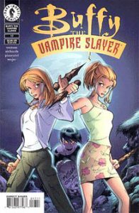
Issues 12-20 (August 1999-April 2000) of “Buffy the Vampire Slayer Classic” consist mostly of further “Buffy”-lite stylings from main writer Andi Watson. But this batch is also notable for bringing novels writer Christopher Golden and TV show writer Douglas Petrie into the fold.
In “A Nice Girl Like You” (12), Golden — who had previously written “The Origin” and the “Angel” miniseries — immediately had me expecting a huge step up from Watson’s work. An omniscient narrator pontificates about evil atop wide-angle shots of Sunnydale, and we meet a girl named Sandy who seems decent but for some reason hangs with the bad boys. But Golden stumbles to the finish line. As with the other new girl, Cynthia, in Issues 6-7, it turns out Sandy’s a demon. Christian Zanier (pencils) and Andy Owens (inks) give atmosphere to the tale by showing the desolate streets of Sunnydale, and they’re also the first artists to really nail Willow’s likeness. But I can tell Golden is new to comics, as the words overpower the art.
The team returns for a more structurally confident sequel, “Food Chain” (16), although the story simply features one of the bad boys from Issue 12, Brad, worshipping another demon. But at least Brad has a reason for his actions beyond “He’s bad”: Similar to Anakin in the “Star Wars” prequels, he thinks the demon can save his mother’s life. In a fun element to this issue, the gang plays volleyball at the beach — they go to the beach once on the show, I think, in “Buffy vs. Dracula” (5.1) — and in an amusing callback to “Go Fish” (2.20), Xander is wearing his swim-team Speedo.
“Double Cross” (20) is a landmark issue for the title, as a TV show writer pens a comic story for the first time. This gives the “Buffy” comic a stronger sense of continuity and canonicity, and it gets our hopes up for a great yarn. Set immediately after “Graduation Day, Part 2” (3.22), complete with scenes from the end of that ep, Petrie’s tale is not bad, but it’s just a quick character sketch. A death demon, who can be in two places at once, thinks the emotionally drained Buffy and Angel will be easy prey, but the former lovebirds realize in their “last thoughts” dream state that they need to split. Thus they go back to fighting the demon – and living. It’s a nice grace note for Season 3.

The rest of this batch is Watson’s “Bad Blood, Parts 4-9,” in Issues 13-15 and 17-19. Storywise, this is more of the vampire Selke working with her sniveling captive doctor to perfect a magical type of blood that will increase her powers. A good illustration of the “throw it at the wall” nature of the storytelling comes in Issue 14 when the doc somehow knows about a vampire sect in Tijuana that worships a bone of a dead Slayer for the sake of protection. Entirely off-panel, Selke’s hench-vamps grab the bone, then return to Sunnydale where the doc tries to create a Dark Buffy via magic.

Coming to a head in Issue 17, the concept of Dark Buffy infiltrating the gang and fighting the real Buffy has potential. However, Watson doesn’t give us one-tenth of the mistaken-identity humor found in “Doppelgangland” (3.16) or the Buffy-bot episodes of Seasons 5-6. Dark Buffy is distinguished by an obsession with clothes and a lack of a moral compass; Giles compares her to Cordelia, rather harshly.
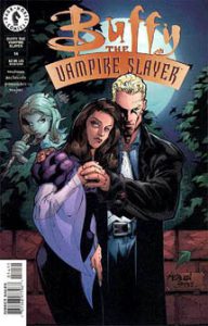
Another interesting element is the appearance of Spike and Drusilla in Issue 14. Off-screen in the wake of “Lovers Walk” (3.8), they got back together. They’ve returned to Sunnydale with the idea of watching Selke’s plan from the shadows and then taking over the town after Selke has offed the Slayer. Since Selke ultimately fails, Spike and Dru end up doing nothing other than watching. To be fair, though, their mere presence does add spice to the long — albeit brisk — Selke saga; and, heck, it’s worth it just for a Jeff Matsuda Spike-and-Dru cover.
Parts 4-9 of “Bad Blood” are distinguished from Watson’s earlier work for being drawn by Cliff Richards (pencils) and Joe Pimentel (inks). They strike me as fast artists, delivering panels that get the job done but are less polished than those of Bennett/Ketcham or Gomez/Florea. Our heroes look good in some panels, not so much in others. Guy Major provides a boost with colors that always set the right mood. Richards/Pimentel abandon the earlier artists’ concept of stylized vampires – green, scaly and sometimes bat-like – and stick closer to the TV show’s design. (Weirdly, Selke wanting to look more human was the impetus for “Bad Blood.” Turns out she needed only to have waited for a new art team.)
Although I didn’t mind Bennett reimagining the look of “Buffy”-verse vampires (and Gomez continuing with it), lining up with the show’s design ultimately makes sense. By the spring of 2000, the “Buffy” comics were wrapping up Season 3 and the TV show was wrapping up Season 4. As such, the comics could now work in the wake of the timeline rather than trying to stay even with it, and thus tie more directly into the show’s narrative, so matching the styles is the right move.
Click here for an index of all of John’s “Buffy” and “Angel” reviews.

